/02 — Brand identity
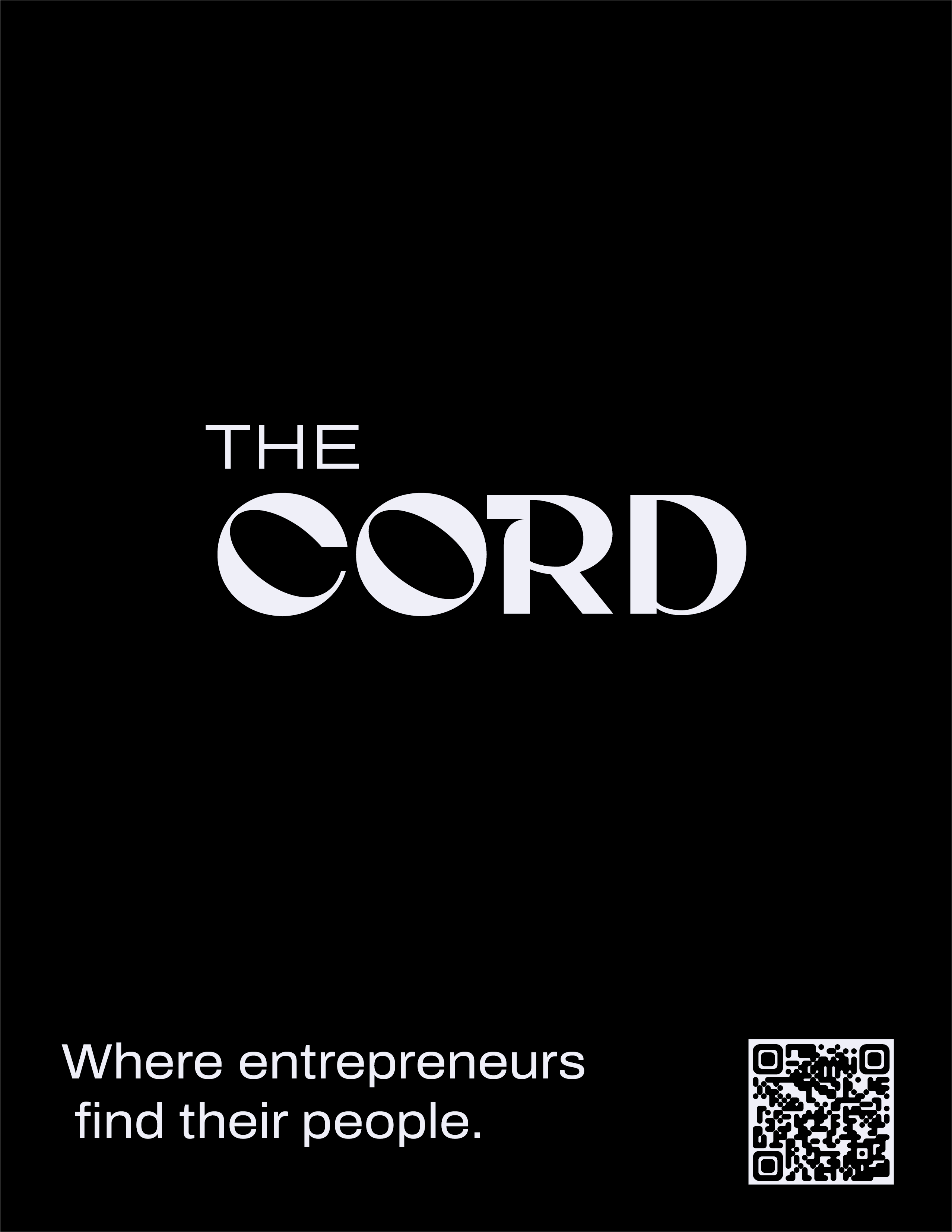
The Cord
A curated social club for ambitious young adults centered around elevated events, meaningful connection, and creative community.
Client
The Cord
Year
2026
Role
Logo Design · Brand Identity · Print Design
Tools
Illustrator · Photoshop · InDesign
01 — Brief
The Brief
The Problem
The branding for The Cord needed to balance the traditional visual language of an exclusive social club with a more youthful and modern aesthetic. Because the target audience skews toward ambitious young adults and emerging entrepreneurs, it was important not to rely too heavily on overly formal or outdated social club motifs.
For a brand like The Cord, perception does much of the heavy lifting. The visual identity needed to immediately communicate a sense of exclusivity, elegance, and elevated experience while still feeling approachable to a younger audience.
The goal was to create a brand that felt refined, modern, creative, and slightly nostalgic. Traditional elements such as editorial typography, physical-paper textures, stamped graphics, and restrained layouts were intentionally incorporated to evoke a sense of permanence and sophistication. At the same time, modern compositions, bold contrast, and contemporary styling helped prevent the brand from feeling overly corporate or inaccessible.
This balance was important because leaning too far into minimal modern branding risked making The Cord feel indistinguishable from other casual social clubs or startup communities. The final direction preserves a sense of timelessness while still feeling current and culturally relevant to a younger generation of founders, creatives, and builders.
Audience
The Cord was designed for ambitious young adults, entrepreneurs, creatives, and builders looking for a more intentional social experience. The target audience values community, creativity, and personal growth, while also being drawn to elevated aesthetics and curated experiences.
Positioning
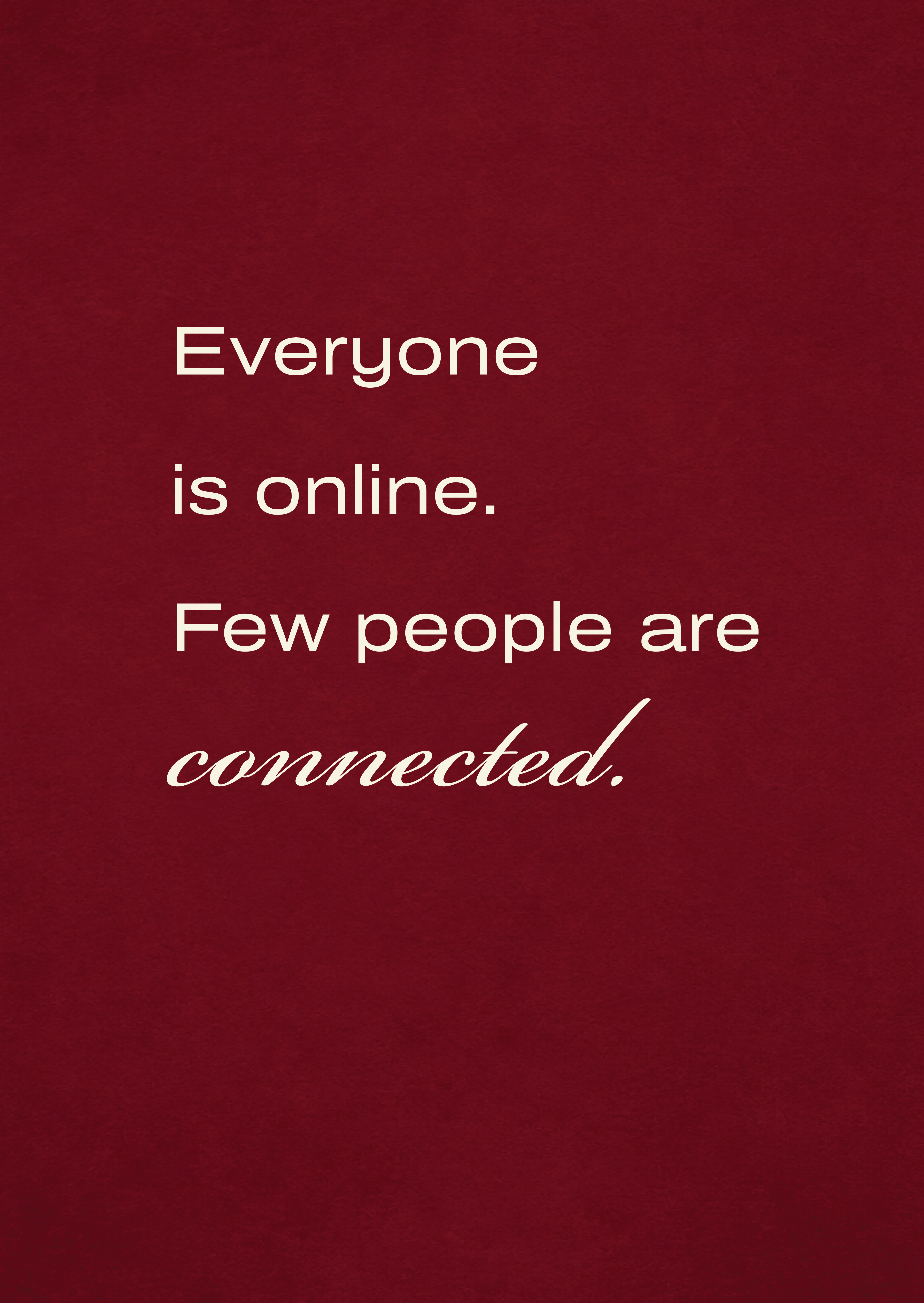
Unlike traditional networking events or casual social clubs, The Cord positions itself as a curated community centered around meaningful connection and shared ambition. The brand needed to feel exclusive and refined without becoming overly corporate or inaccessible.
Brand Attributes
- Elevated
- Intentional
- Modern
- Exclusive
- Creative
- Editorial
- Sophisticated
- Community-Driven
Tone of Voice
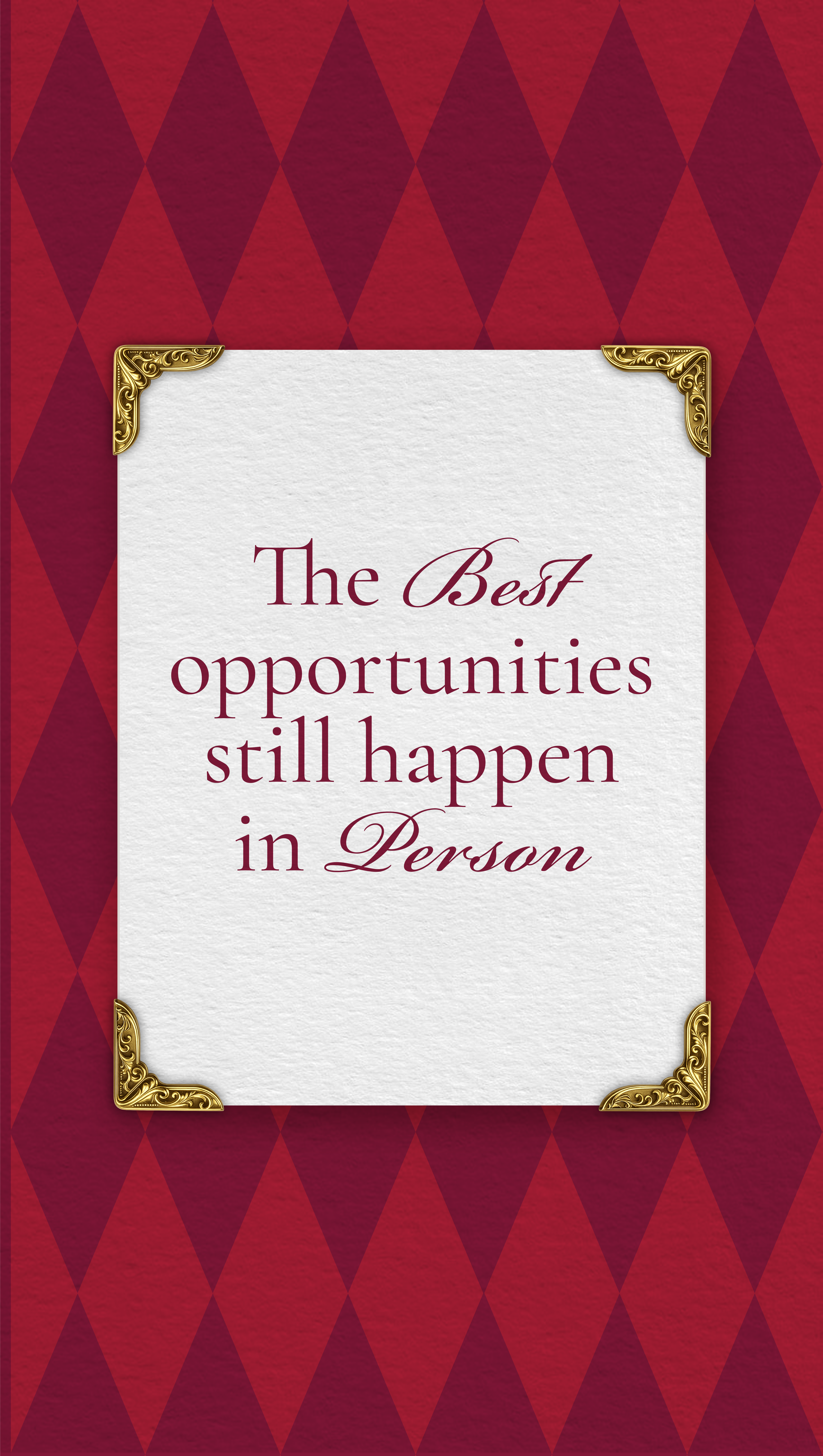
The tone of the brand is confident, refined, and conversational. Messaging avoids overly corporate language and instead focuses on creating a sense of belonging, curiosity, and cultural relevance.
Visual Direction
The visual identity combines traditional social club influences with contemporary editorial styling. Serif typography, paper textures, stamped graphics, and restrained layouts were used to create a timeless and sophisticated foundation, while modern compositions and bold contrast helped the brand feel youthful and culturally current.
Core Goal
The primary goal of the branding was to make The Cord feel like more than just an event series. The identity needed to create the feeling of being invited into something intentional, elevated, and socially valuable.
02 — Identity
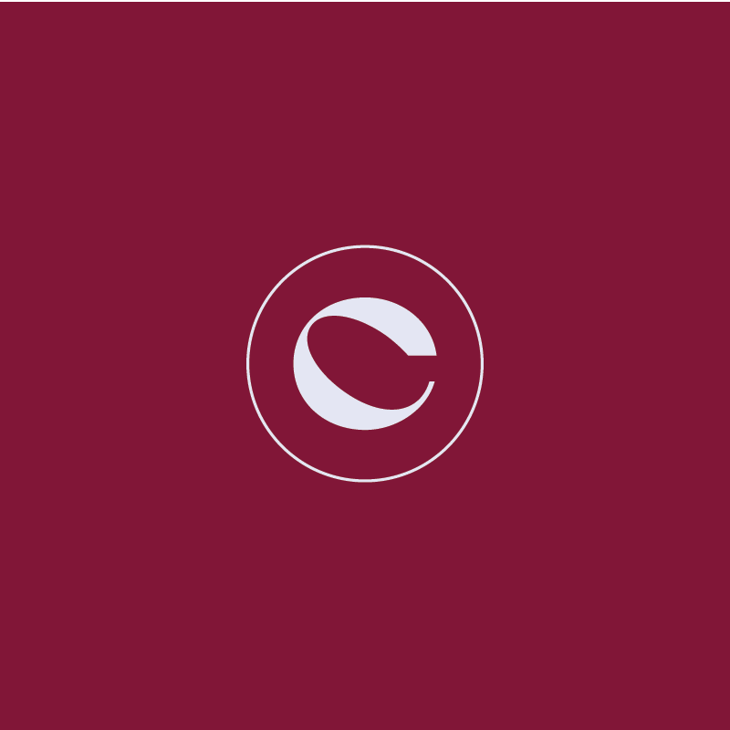
Logo system
A primary horizontal lockup, a stacked variant for square applications, and a single-letter monogram for social and small-scale marks.

03 — Typography
Typeface system
A trio working in three registers — a refined serif for headings, a wide modern sans for body, and a copperplate script for occasional accents.
Heading
Cormorant
Garamond
Regular · Italic
Aa
Where ambition finds its people.
ABCDEFGHIJKLMNOPQRSTUVWXYZ
abcdefghijklmnopqrstuvwxyz
0123456789 & ?!.,—
Body
Archivo
Expanded
Regular
Aa
Building something big is better with people who get it.
ABCDEFGHIJKLMNOPQRSTUVWXYZ
abcdefghijklmnopqrstuvwxyz
0123456789 & ?!.,—
Accent
Bickham
Script Pro 3
Regular · Adobe Fonts
Aa
By invitation only.
ABCDEFGHIJKLMNOPQRSTUVWXYZ
abcdefghijklmnopqrstuvwxyz
0123456789
04 — Color
Palette
Two wine reds carry the brand's warmth and authority. Two near-whites — one warm cream, one cool white — provide the light surfaces for print and digital. A near-black grounds everything.
Primary brand
Accent · hover
Warm surface
Light surface
Primary surface
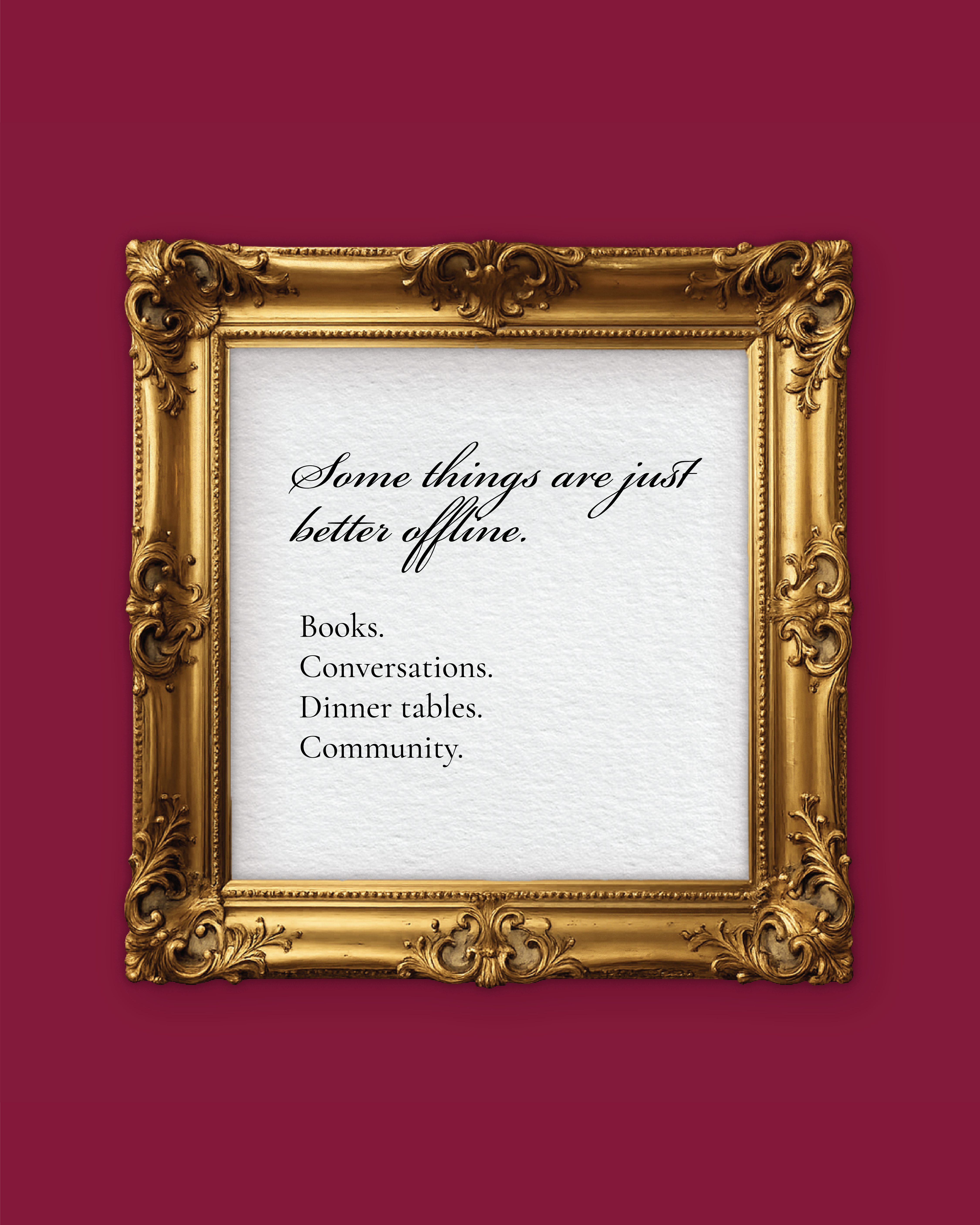
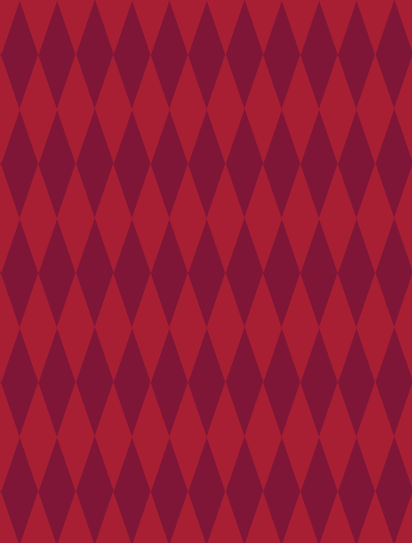
05 — Brand elements
Motifs & marks
A small set of repeatable graphic elements ties every touchpoint together — the sliced C monogram, hand-stamped seals, and editorial rules. Used sparingly, they make the system feel cohesive without ever feeling templated.


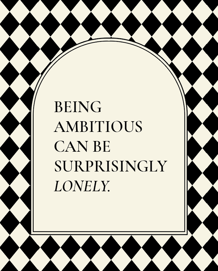
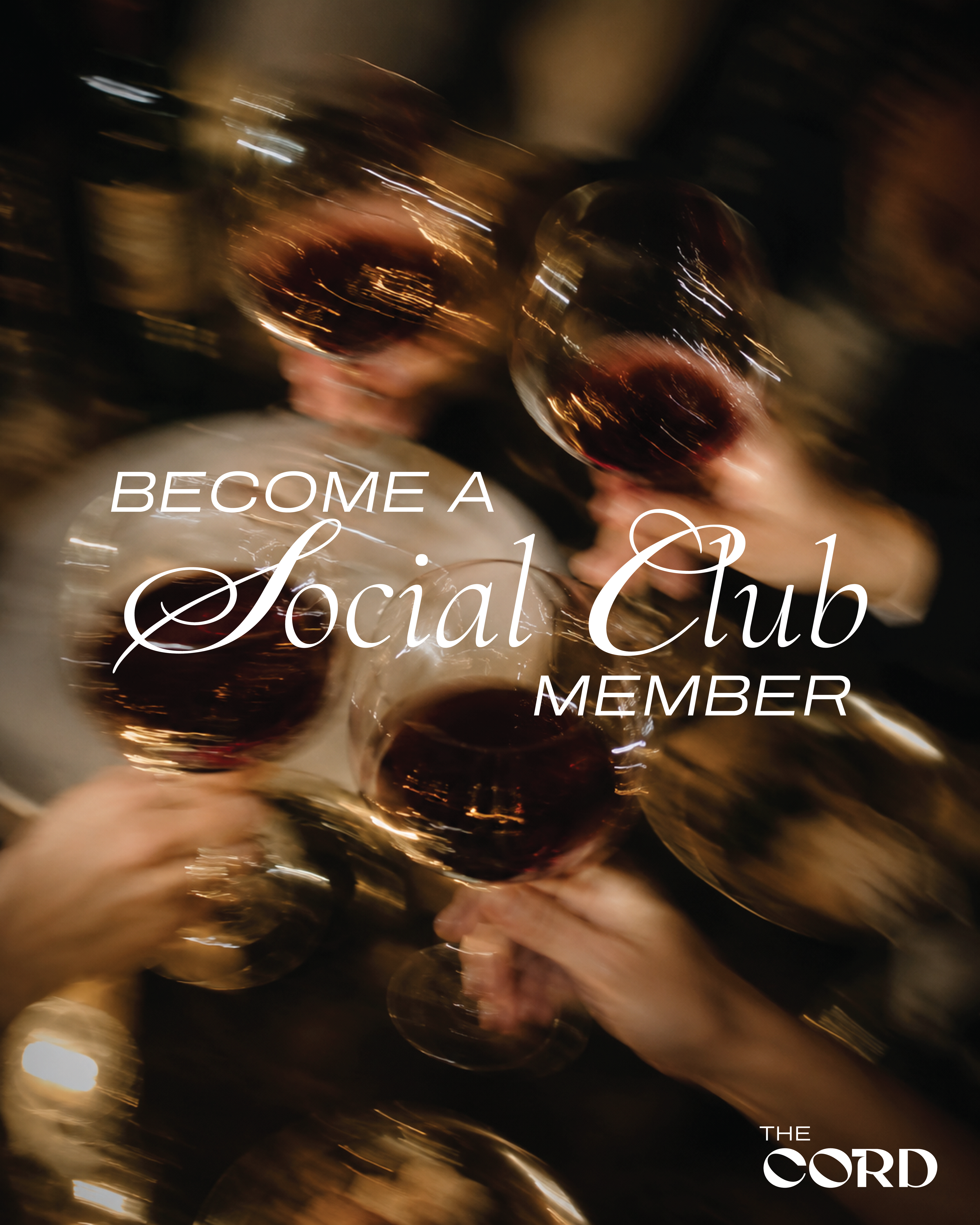
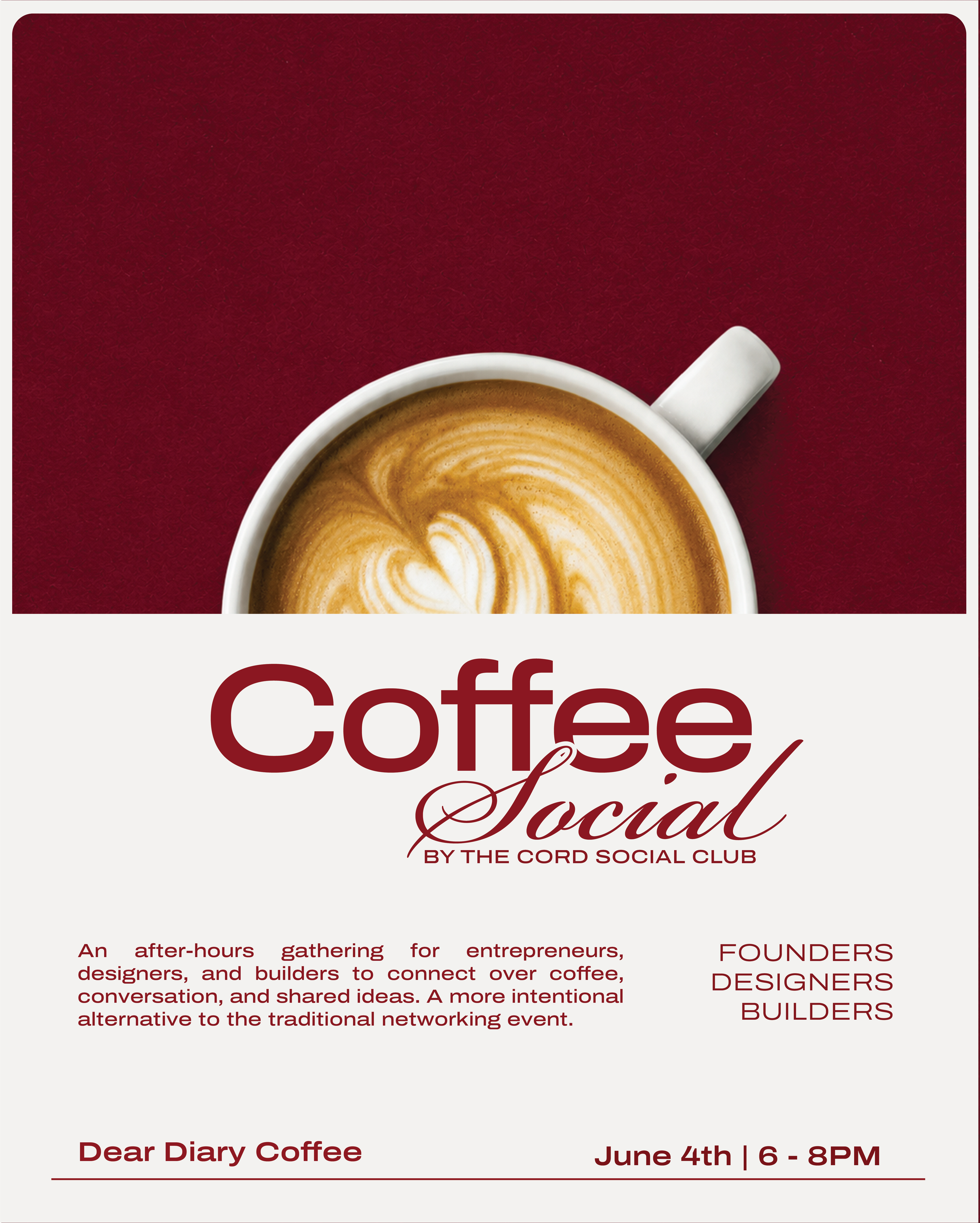
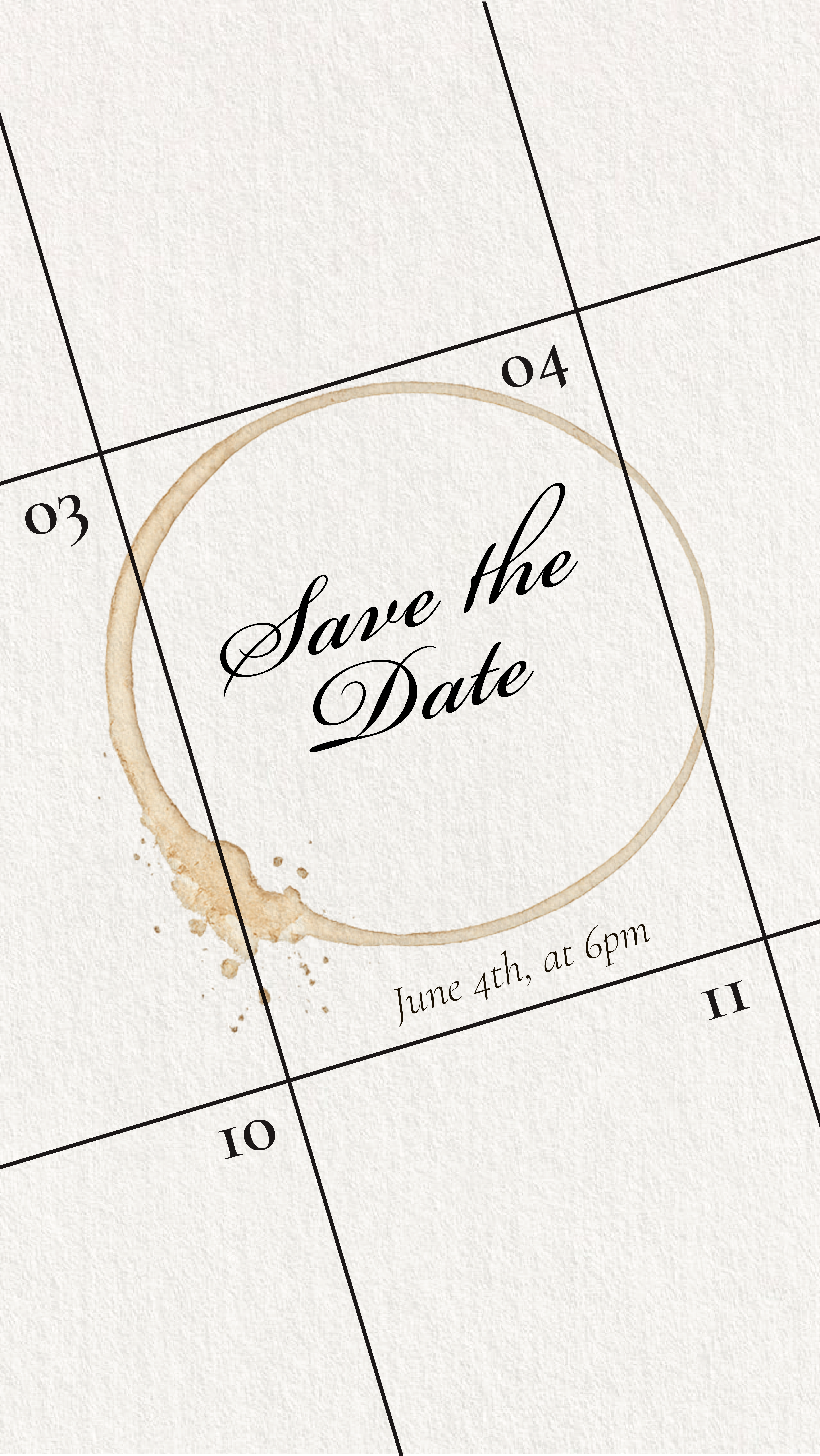
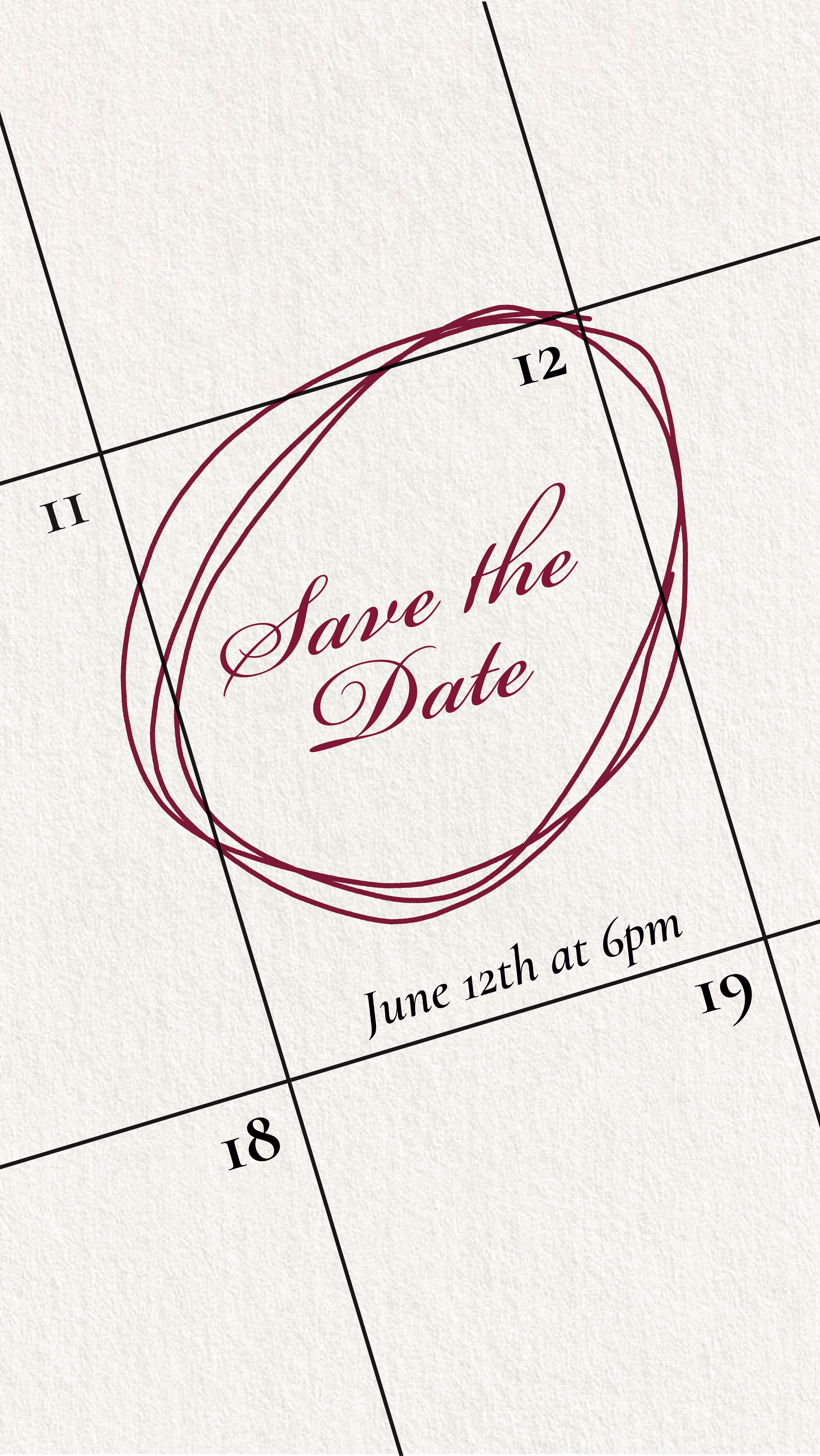
06 — Applications
Applications
Print, environment, and screen — invitations, posters, on-site signage, ticketing, food & beverage menus, and the website.
07 — Social
Social system
Vertical reel covers, typography-led posts, and a story template kit — designed so any future event drops into the system without breaking visual continuity.
Reel covers
Typography posts